
New England Living, June 13, 2017
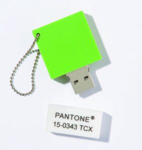
The Pantone Color of the Year for 2017, Greenery, comes to us with a promise of renewal and rejuvenation. Just saying the name evokes images of spring, the outdoors and new beginnings. Indeed, this verdant shade was selected for its implications in bringing forth feelings of promise, hope and renewal, according to Leatrice Eiseman, executive director at the Pantone Color Institute. Eiseman is none other than the woman in charge of choosing the color of the year.
How is the color of the year chosen?
“We look at lots of indicators,” says Eiseman. “We’re at tradeshows worldwide, and we look at what we think are ascending colors.” These are what color forecasting groups look for in terms of what’s hot. “The fashion industry is always a big indicator,” Eiseman adds, noting that greens have been growing in popularity over the last year. Other indicators are signage, brand image, even stage lighting, in industries such as arts and entertainment. “We look for the symbolic meaning of color, and the fact that Greenery has been on the rise indicates a general feeling of ‘going green,’ or nature, or that of ‘fresh.’”
Judith van Vliet of the Color Marketing Group (CMG) agrees. “CMG’s collaborative color tribe had predicated and announced at the 2015 San Diego International Summit how important green would be for 2017, so we were not surprised by Greenery,” she says. Based in Alexandria, Virginia, CMG is a nonprofit color forecasting association that focuses on color trends in four global areas: North America, Europe, Asia and Latin America.
According to CMG’s executive director, Sharon Griffis, CMG holds color forecasting events throughout the year in global locations. Participants from all industries discuss color trends and influences and how these will impact color directions. The results from these events are curated by CMG members to form CMG’s World Color Forecast™ which is revealed annually at the International Summit. The World Color Forecast™ comprises 16 colors from each region that CMG members believe will trend two years out.
So what does all this mean for interior design in New England? That, according to Nina Farmer of Boston-based Nina Farmer Interiors, ultimately comes down to the client’s own personal taste. “It’s always interesting to me to see where color choices are going. But ultimately, it’s up to my client what they want to surround themselves with.” She adds that her Boston clients are more apt to decorate with classic colors than the “hottest new thing.” With many greens such as emerald and hunter green being on the “classic” side, Farmer can see Greenery being used as an uplifting accent color.
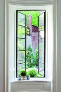
Connecticut-based interior designer Lynn Morgan of Lynn Morgan Design echoes Farmer’s sentiments. “It can be a great accent color to those classic greens and blues,” she says. She’s enthusiastic about Pantone’s choice of Greenery. “It’s fresh and new, and it speaks to everyone, whether it be about being outdoors, gardening or ‘going green.’” Color of the year or not, Morgan says that she happens to like Greenery, and has used it often in creating styles with splashes of color, pairing it with blues, whites and creams.
“We look to the symbolic meaning of color,” Pantone’s Eiseman says. “Greenery, again, is symbolic of nature.
It’s fresh, it’s being outdoors at a park. If a person can’t get out too often, for instance, they can bring Greenery into the home.” Splashes of color add a touch of brightness and inspiration for 2017.
“Green stands for a refreshing new start,” concurs CMG’s van Vliet. “Maybe we have finally arrived to this tipping point and real change is at the horizon.”
Written by Marina Davalos